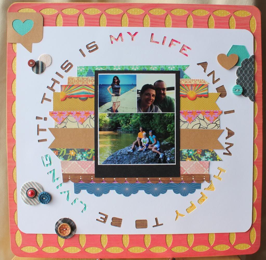
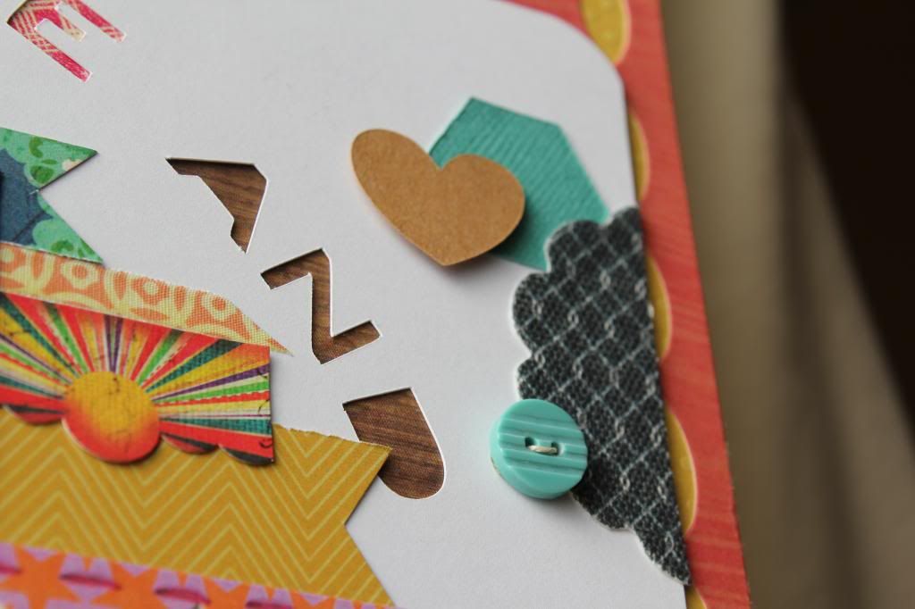
This is a different style compared to how I typically scrap, but it is one of my favorites. Some day, I may change out the photo to a single picture. I cut the circle of words on my Silhouette and laid that on top of the orange-ish precut patterned paper I had. I then backed it with a golden swiss dot cardstock. The strips of paper behind the photo are not just scraps but also, papers that either remind me of a different project I've done or that just make me happy!
I appreciate you stopping by and looking today! As always, if there is anything that you'd like to see more of, let me know! Also, I've been on a baking spree lately so I think my next post will be pertaining to my sweet tooth with recipes included. Sound good? Until next time...
Scrap Happy~
Melissa


I love this layout Melissa! So bright and happy!
ReplyDeleteI love the look of the new page.
ReplyDeleteThis LO is amazing!! Love it!
ReplyDeleteThe new look
ReplyDeleteIs fab and I love this Layout!!
This layout is amazing, Melissa!
ReplyDeletelove the new look! and the layout is awesome, I need to remember to use the negative space from my cuts more. so cool.
ReplyDelete